Ready to Find a Plan That Works for You? Let’s Talk. +61399692102

July 23, 2026

OZ ICT, Case Study

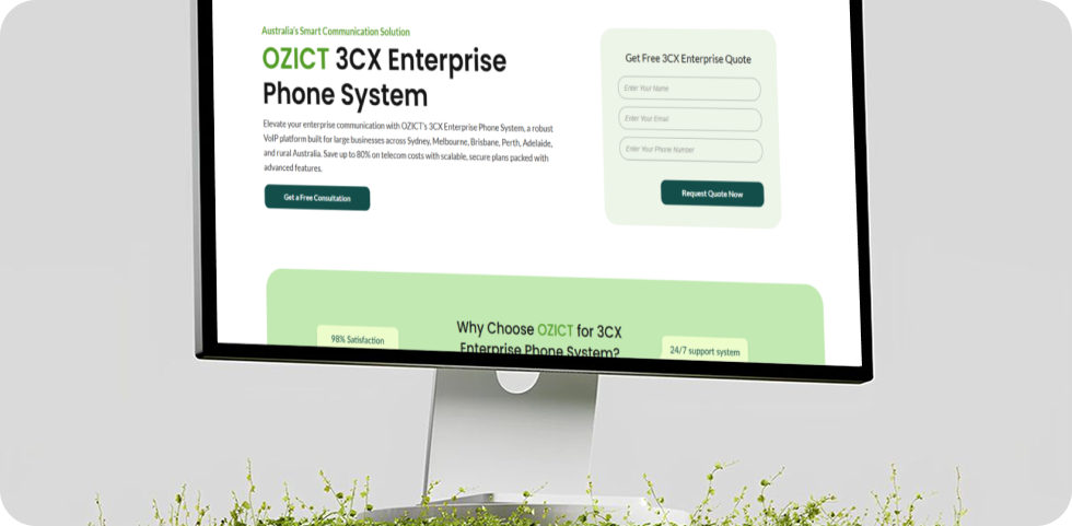
3CX enterprise phone system page designed for the OZ ICT website

Introduction

OZ ICT is an Australian company providing business phone systems, VoIP, internet, and communication solutions for small and medium-sized businesses. Their previous website did not clearly explain their services or encourage visitors to make an enquiry. They needed a modern, easy-to-use website that would present their services clearly and help generate more leads.

Project scope and approach

The original OZ ICT website was a basic landing page that did not clearly explain the company’s services or guide visitors towards taking action. The project focused on improving the website’s structure, messaging, navigation, and lead-generation opportunities.

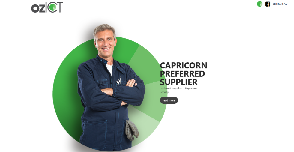
  • Unclear Call to Action: The “Read More” button did not encourage visitors to request a quote or contact the company.
  • Unclear Messaging: The website highlighted OZ ICT as a “Capricorn Preferred Supplier” but did not clearly explain its main services or customer benefits.
  • Limited Navigation: Important links such as Services, About, and Contact were missing.
  • Ineffective Carousel: Important content was placed inside a carousel, making it easy for visitors to overlook.

Before

Previous version of the OZ ICT website before the redesign

After

The redesigned OZ ICT website focuses on generating more enquiries and making information easier to find. Clear messaging, simple navigation, and strategically placed calls to action now guide visitors towards contacting the business.

  • Strong Headline: The hero section clearly communicates how OZ ICT can support business growth.
  • Quick Quote Form: A “Get Your Free Telecom Quote” form allows visitors to submit an enquiry immediately.
  • Clear Navigation: Services, About, Capricorn Members, and Contact Us are now easy to access.
  • Better Calls to Action: “Get a Free Consultation” buttons and enquiry forms are placed throughout the website to increase conversions.
Hero mockup of the redesigned OZ ICT website with a modern and responsive interface

Business Challenges

The original OZ ICT website worked more like a basic online brochure than a platform designed to attract customers and generate enquiries. It did not provide visitors with a clear path to follow or encourage them to take action. The general “Read More” button was not strong enough to guide users towards requesting a quote, booking a consultation, or contacting the team.

The website’s messaging also lacked clarity. Although the “Capricorn Preferred Supplier” badge helped establish trust, the page did not clearly explain what OZ ICT offered, how its services could support businesses, or why customers should choose the company.

Navigation was another major issue. Important links such as Services, About, and Contact Us were missing, making it difficult for visitors to explore the business or find the information they needed. Key content was also placed inside a carousel, where it could easily be overlooked.

Overall, the website lacked a clear structure, strong calls to action, and an effective customer journey. These issues limited its ability to build trust, capture leads, and turn website visitors into potential customers.


Original OZ ICT website design before the complete redesign

Before

Home – OZ ICT

Old Website


Hero mockup of the redesigned OZ ICT website with a modern and responsive interface

After

Home – OZ ICT

The Redesigned site

NAFCORP’s Approach

Our approach focused on transforming the website from a passive information page into an effective lead-generation platform. We replaced the image-focused hero section with a strong, benefit-driven headline: “Unleash Your Business Potential with OZICT Telecom.” This immediately communicates the value of OZ ICT’s services and creates a stronger connection with business customers.

We also added a “Get Your Free Telecom Quote” form directly to the hero section. This allows visitors to submit an enquiry without searching through the website, making the process faster and easier. Clear calls to action, improved messaging, and a more structured layout now guide visitors from discovering the services to contacting the OZ ICT team.

Navigation & Mega Menu

To solve the limited navigation problem, we introduced a structured mega menu that gives visitors quick access to OZ ICT’s complete range of services. Services are organised into clear categories, such as Voice Solutions and Connectivity Plans, making the website easier to explore.

Visitors can now quickly find specific options, including Business Phone Systems, VoIP, CRM Integration, SIP Trunking, and NBN Internet Plans, without searching through multiple pages. We also added a “Let’s Talk” call-to-action within the menu, providing a direct path to request a free consultation.

This improved navigation reduces unnecessary clicks, makes services easier to understand, and helps visitors move smoothly from exploring a solution to submitting an enquiry.

Custom mega menu designed for the OZ ICT website with intuitive navigation

Replacing Generic Imagery

The original website used generic, stock-style visuals that did not clearly represent OZ ICT or its services. As part of the redesign, we created purposeful, custom visuals inspired by the telecommunications industry, business phone systems, and connectivity solutions.

These visuals give the website a more distinctive and consistent identity while making each service easier to understand. This approach helps OZ ICT appear more professional, trustworthy, and memorable to potential customers.

Custom illustrations and visual assets created for the OZ ICT website redesign

    Project Type